Images
When you register a profile in the Creatives Across Sussex directory you can add images, videos and audio, turning your profile into a mini portfolio.
This section of the site shows all the media added by members of the network. You can choose to view images, video or audio via the navigation menu.
To add your images, video or audio, register and log into My Space.
Search Images
- Share on your website
Share on your website
To include this search on your website, copy the following code and paste it into your HTML:
<!-- Begin Creatives Across Sussex embed code --> <iframe src="https://www.creativesacrosssussex.com/directory/images/?month=9&network%5B0%5D=2&page=45&embed=1" width="100%" height="100%" style="min-height:400px;"></iframe> <!-- End Creatives Across Sussex embed code -->
Images / 661 to 675 of 957
Show All / A / B / C / D / E / F / G / H / I / J / K / L / M / N / O / P / Q / R / S / T / U / V / W / X / Y / Z
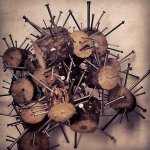
Agro Stack
Intended to be paired with "Agro Box" this piece was intended to represent extreme emotions such as anger and hatred, piling up into a structure that is almost organic. Completely movable the whole piece was intended to .....Read more
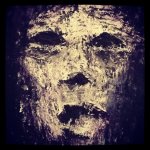
Zombie
"Zombie" is the third oil painting I have produced as part of my self controlled project for summer. Whilst the piece is entitled "Zombie", this term is used quite loosely. The painting is intended to represent a pe.....Read more
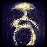
Sing
"Sing" is the eighth (I think) oil painting that I have produced of late. One reason that I am concentrating a lot of my attention on paintings lately is because I want to develop my style within the discipline. I have.....Read more
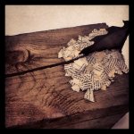
See Saw
"See Saw" was a completely random creation. I had been developing emotive work, mostly based around aggression when I found the broken saw blade in the scrap metal bin in the Sculpture workshop. Instantly my magpie insti.....Read more
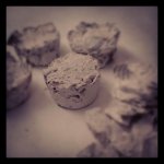
Compact
"Compact" is a process led piece that all started with the destruction of a book. I then used plaster, and a mini-muffin silicon baking tray to create a compact and altered reconstruction of the book itself. Based around.....Read more
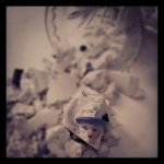
Broken
Another piece inspired by the idea of aggression and the transformation that it can cause. "Broken" is intended to express the frailty of life. The piece represents the idea that most people spend far too much time being.....Read more
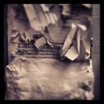
Plastered Pages
"Plastered Pages" is a mixed media piece intended to represent both extreme aggression and serene calm. ..Read more
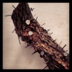
Mace
"Mace" is intended to represent aggression fully. As a very tactile piece it is intended to encourage the viewers to touch something that they feel they should not want to touch. ..Read more
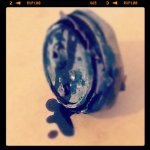
Macabre
"Macabre" is just that, it's "disturbing and horrifying because of involvement with or depiction of death and injury". I wanted to create something that would cause the viewer to think. I like the idea of making the view.....Read more
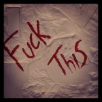
F This
"F This" was a textured painting I created that was based around the idea of consumerism. Consumerism itself is something that confuses me, I want things that I don't need and I don't understand why. The background o.....Read more
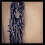
Levi
"Levi" was inspired by various artists who focus on both sculpture and textile based pieces. It is an organic and fresh representation of destruction, suspended mid air and hanging freely to the floor. ..Read more
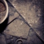
I Was Here .01
"I Was Here" was a unit of work that I concentrated on last summer. The whole unit of work is intended to create a vision of what will be left behind at the end of it all. Inspired by various war photographers and photoj.....Read more
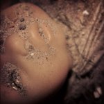
I Was Here .02
The second of a collection of images I created that represented what would be left behind. ..Read more
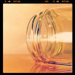
Honey .01
"Honey" was another series of images that I worked on last Summer. I wanted to create a message about how the Western World was/is becoming more and more accustomed and comfortable with the idea of throw away luxury. In .....Read more
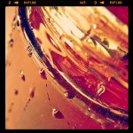
Honey .02
"Honey" was another series of images that I worked on last Summer. I wanted to create a message about how the Western World was/is becoming more and more accustomed and comfortable with the idea of throw away luxury. In .....Read more
